close
Results:
No results found
-
 Menú close
 - arrow_forward_iosAddons from PrestaShop
- Addons from PrestaShop arrow_back_ios
- arrow_forward_iosProduct Page PrestaShop Modules
- Product Page PrestaShop Modules arrow_back_ios
- Personalised products
- Reservations and rentals
- Sale of tickets
- Management of taxes on products
- arrow_forward_iosPrestaShop Modules for Logistics and Transportation
- PrestaShop Modules for Logistics and Transportation arrow_back_ios
- Personalisation of shipments
- Click & Collect
- arrow_forward_iosModules for payment
- arrow_forward_iosStore management
- Store management arrow_back_ios
- Utilities
- Taxes
- Customer Support
- Importers/exporters (Dropshipping)
- Best sellers
- arrow_forward_iosTypology
- arrow_forward_iosServices
- Services arrow_back_ios
- arrow_forward_iosDeveloped by PrestaShop
- Developed by PrestaShop arrow_back_ios
- PrestaShop is updated
- Migration to Prestashop
- Improvement in performance of PrestaShop
- Specific developments
- arrow_forward_iosPrestaShop made to measure
- PrestaShop made to measure arrow_back_ios
- Custom PrestaShop modules
- Customizing PrestaShop modules
- Creation of PrestaShop
- arrow_forward_ioshosting Prestashop
- hosting Prestashop arrow_back_ios
- Hosting for PrestaShop
- Google cloud for Prestashop
- Hosting consulting services
- arrow_forward_iosMarketing and advertising
- Marketing and advertising arrow_back_ios
- SEO for prestashop
- SEM for PrestaShop
- Promotion
- arrow_forward_iosOur solutions
- arrow_forward_iosCreate online stores
- Create online stores arrow_back_ios
- arrow_forward_iosPrestaShop online store
- PrestaShop online store arrow_back_ios
- Custom PrestaShop
- PrestaShop cloud
- arrow_forward_iosMigration
- Migration arrow_back_ios
- From PrestaShop
- From another application
- Other sites
- Sectoral PrestaShop stores
- arrow_forward_iosSpecial rates
- Special rates arrow_back_ios
- Hour bonuses for PrestaShop development
- arrow_forward_iosSectors
- arrow_forward_iosTypology
Increase sales from your online store on Black Friday and Christmas thanks to the mobile
Carry out a marketing strategy for Christmas or Black Friday in which do not include the mobile point of sale is unthinkable. The first step is to improve the customer experience and have a web design responsive enabling navigation via mobile phone.
Actualizado: 08/03/2024
512

Compartir:
Mobile or smartphone has become indispensable in daily life and it is already used for any type of action, does not even need to carry cash or a card above if you have a smartphone.
In a study of Flurry Analytics You can see the growth that has taken in 2016; but in 2017 that growth remains faster. Consumer trends are marked from everyday life and you have an online store already is not enough without a responsive web design or a mobile application.
In addition, it is an indisputable reality that about 40% of annual sales occur between the eve of Christmas and the January sales, both physical stores and online. The last weekend of November is which gives rise to the Black Friday and Cyber Monday that it is already regarded as the official start of Christmas shopping. Consumers eagerly this first big event with discounts that can reach 80%. Many of them with planned purchases and another in an effort to find "the bargain", doing that many purchases are compulsory.
Prepare your Prestashop store to capture sales and improve the customer experience
There are many strategies marketing online that we could describe for Black Friday and Christmas; but we're going to start with a very important aspect. your Prestashop is 100% responsive?
Google gives priority above all the user experience and puts to work for this organic SEO. We live in a world dominated by mobile phones and user consumption habits have changed. The majority of purchases still becoming the computer; but the searches and the choice is made from the mobile so it should give it all the weight and the importance that has.
Have a responsive design template (adapts to reduce the size of the window) is the first step for your buyers have a good shopping experience and they have easily navigating the page. The second step is to be well optimized for tablets, mobile and even smart TVs showing only the essential elements for each case.
You can do a test of your website in think with Google: a tool test that will give you results online of how charging your Prestashop ecommerce on mobile phones instantly.

If the version of your Prestashop store is old and does not have templates responsive we can offer you different solutions: upgrade to a higher version, as it can be PrestaShop 1.7, or develop adaptation to measure if you have a personalized store. Consult us If you have any doubts, as experts in Prestashop we will offer you the best solutions for a responsive web design.
Increase your sales with your mobile friendly store
2016 more than half of the searches were carried out from mobile (53%) to the detriment of computers (36%). Help customers find you so the weekend of Black Friday and Christmas can be decisive in the success of your eCommerce.
Greater number of accesses from other devices
Access to web pages from the mobile exceeds two years entering pages from your computer. And progression continues to grow.
Tablets, Smart TVs are other two devices that have downplayed the use of the computer.
Higher rate of conversion and reduction in the rate of rebound
It is important to make that access to the web; But if once the customers visiting your online store will be a few seconds is as if you had not achieved anything. This situation is very common if web design is not responsive.
You will improve your SEO
From July 2015 Google penalizes on organic positioning any website that is not responsive. This has led to a drop in visits and lost sales.
It improves search for geolocation
If you own a local business associated to your Prestashop store a responsive design It will benefit to your viewing from mobile devices according to proximity through Google Maps, places or business.
Conclusion
Sell more during the time of increased consumption of the year has as a prerequisite to be where your customers seek you: on your mobile or smartphone. And then develop a strategy of marketing actions of mobile marketing that converts into sales.
-
 Improvements for your Prestashop store SOLVED: Redsys has not recorded my store payments since May 30
 -
 Improvements for your Prestashop store The success of Materiales de fabrica thanks to Megaproduct
 -
 Improvements for your Prestashop store What happens when you can't update Prestashop?
 -
 Improvements for your Prestashop store Add Paypal payment in your PrestaShop shop
-
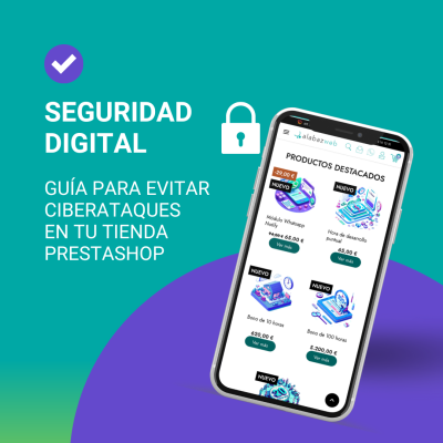 Improvements for your Prestashop store Essential Security Guide for PrestaShop: How to Fortify Your Store Against Cyber Attacks
 -
 Improvements for your Prestashop store Transform Your Online Business: Upgrade to PrestaShop 8 with Alabaz and the Digital Kit
 -
 News about Alabaz Web Pro Discover E-Commerce Innovations: AlabazWeb Blog is back
 -
 Improvements for your Prestashop store SOLVED: Redsys has not recorded my store payments since May 30
-
Improvements for your Prestashop store SOLVED: Redsys has not recorded my store payments since May 30
-
 Improvements for your Prestashop store The success of Materiales de fabrica thanks to Megaproduct
 -
 Improvements for your Prestashop store What happens when you can't update Prestashop?
 -
 Improvements for your Prestashop store Add Paypal payment in your PrestaShop shop
Escribe un comentario